Interpretation of the Patlak plot
The following is an attempt to make the Patlak plot understandable as more than just a mathematical description of data. First the basic math behind the Patlak plot is described, using a simple model. Then the math is commented and interpreted. Finally, generalizations to more complex models are discussed.
Basic math in a simple model
The Patlak plot is useful in compartment models with irreversible uptake of a tracer. The following is a very simple example of such a model with just one tissue compartment (1TC model):
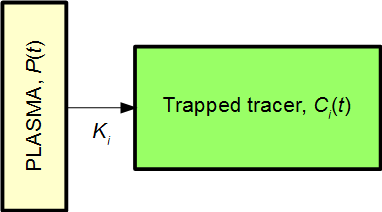
,where P(t) is the plasma input function, and Ci(t) is the signal within the given region-of-interest (ROI) from the tissue compartment irreversibly trapping the tracer. The signal measured from the ROI will then be
The above simple system is described by the equation
Integration gives Ci(t):
Inserting Ci(t) from Eq. 3 into Eq. 1 yields
As in Eq. 1, this is signal from the tracer irreversibly taken up plus background. The background signal can be reduced to a constant value if we divide by the input function:
Defining
it becomes clear that Eq. 5 can be expressed as a straight line – the Patlak plot:
Given the input function P(t) and the measured ROI signal ROI(t)x and y can be computed for each time point. The slope of the line is the rate of net influx, Ki.
Further comments:
- In practice, the Patlak plot is only linear after some time, when steady-state conditions apply outside the compartment of reversible uptake. Even for the simple 1TC model discussed above, a bolus injection of tracer will need a short time to be well-mixed within the plasma.
- For the simple 1TC model, the line's intercept with the y axis can be interpreted as the blood volume VB (Eq. 8). In more general models, this volume will be a mixture of the blood volume and the reversible volumes but with no simple interpretation of the precise value.
- Interpretations of x and y are given in the following section.
Interpretation of the math in the simple model
General comments
Eq. 2: The net influx happens with speed Ki×P(t), that is, a constant times the concentration of tracer presented to the system through the input function.
Eq. 3: The amount of tracer taken up by time t is calculated by integration of the speed. By analogy with a car: The integral over speed corresponds to the distance driven since time zero.
Eq. 4: The measured signal comes from the tracer irreversibly taken up, plus a background signal proportional to the input function.
Eq. 5: Division by the input function makes the background a constant value. The disadvantage is that the other two terms (x and y) becomes difficult to interpret.
Interpretation of x
Eq. 6: Using the car analogy from the comment on Eq. 3, the integral corresponds to distance driven, while P(t) corresponds to speed at point t. If the “speed” has been constant, then x is simply the time since start:
x = distance/speed = time = t (only valid for constant speed)
However, in most cases, the speed has not been constant, and x is a kind of “normalized time” or more precisely:
x = distance / current speed = the time needed to drive the distance using current speed
For example, if a car drives at speed 100 km/h for one hour, then at speed 80 km/h for an hour, and then at speed 50 km/h for an hour, the values of x will be:
x(1 hour) = (100 km) / (100 km/h) = 1 hour
x(2 hours) = (100 km + 80 km) / (80 km/h) = 2.25 hour
x(3 hours) = (100 km + 80 km + 50 km) / (50 km/h) = 4.6 hour
That is, after 3 hours the car has driven 230 km, which would have taken 4.6 hours with a constant speed of 50 km/h. Since the car has not driven with constant speed, this “normalized time” of 4.6 hours is not equal to the actual time.
Turning to the kinetic model, we can interpret x as “normalized time” in the following sense:
x is the hypothetical time it would have taken to irreversibly accumulate this amount of tracer, if the input function had been at the current value from the beginning of the study.
Put another way:
x is time normalized for the variations in plasma concentration.
For a tracer study with constant infusion, the input function would indeed be constant, and we would obtain x = t. In fact, a tracer study with constant infusion will automatically be linear and therefore not need the Patlak plot.
For studies with bolus injection, the plasma concentration (input function) will usually peak and then decrease for most of the study. Such continuous “deceleration” will result in “normalized time” (x) being increasingly higher than real time (t).
Interpretation of y
Eq. 7: Like x is normalized time, the y value is a kind for normalized measured signal. Again, the normalization, division by plasma concentration P(t), can be interpreted as a compensation for the variations in plasma concentration over time. Assuming that signal and input function are measured in the same units (e.g. Bq/mL), y has no unit.
y is the measured signal normalized for the variations in plasma concentration, expressed as the unitless value y = (measured signal)/(input function).
The Patlak plot
For tracer studies using constant infusion of tracer, the Patlak plot is not needed: When steady-state has been achieved, net influx will have a constant rate = Ki, and signal plotted as a function of time will be a straight line with slope being Ki times the value of the constant input function.
Eq 8: For tracers studies with non-constant plasma concentration, e.g. bolus injection, plasma concentration will vary with time. But normalization of both time (as x) and signal (as y) corrects for this variation and results in a straight line with slope Ki = net influx rate.
More complex models
It turns out that the Patlak plot also is useful in far more complex models than the simple model discussed above.
A two-tissue compartmental (2TC) model with irreversible uptake can be used as an example:
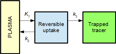
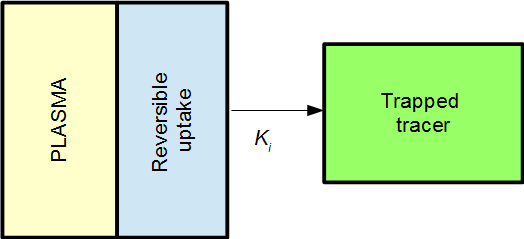
The Patlak plot will in then become linear when the reversible compartment is in steady-state equilibrium with the plasma, i.e. when the ratio C1(t) / P(t) becomes stable. When that is the case, the reversible compartment(s) essentially behaves as an extension of the plasma input function, and the irreversible uptake can be described as an effective net influx rate Ki.
In 2TC model from above, the effective net influx rate constant becomes
This can be interpreted as K1 being the primary uptake constant, but of this only the fraction k3/(k2+k3) ends up in the irreversible compartment.
For models with several reversible compartments, the Patlak plot will be linear from the time when all reversible compartments are in steady-state equilibrium with the plasma. The slope of the Patlak plot will again be Ki, the effective net influx rate, although the analytic expression for Ki is not necessarily simple to derive.
If the Patlak plot is used for a system without irreversible compartment, this corresponds to Ki= 0, and the Patlak plot will become a flat line.
See also:
- Ki
- Multiple-time graphical analysis
- Fractional Uptake Rate (FUR)
- Equations for graphical analysis of irreversible tracers (Gjedde-Patlak plot)
- Patlak plot from regional TACs with plasma input
- Patlak plot from regional TACs with reference tissue input
References:
Gjedde A. Calculation of cerebral glucose phosphorylation from brain uptake of glucose analogs in vivo: a re-examination. Brain Res. 1982; 257: 237-274.
Logan J. Graphical analysis of PET data applied to reversible and irreversible tracers. Nucl Med Biol. 2000; 27: 661-670.
Patlak CS, Blasberg RG, Fenstermacher JD. Graphical evaluation of blood-to-brain transfer constants from multiple-time uptake data. J Cereb Blood Flow Metab. 1983; 3: 1-7.
Patlak CS, Blasberg RG. Graphical evaluation of blood-to-brain transfer constants from multiple-time uptake data. Generalizations. J Cereb Blood Flow Metab. 1985; 5: 584-590.
Rutland MD. A single injection technique for subtraction of blood background in 131-I-hippuran renograms. Br J Radiol. 1979; 52: 134-137.
Tags: MTGA, Patlak plot, Ki
Updated at: 2014-02-06
Created at: 2014-01-21
Written by: Lars Jødal